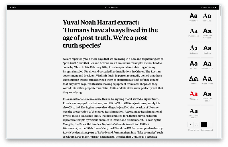
Use Klim Reader, If You Value A Great Reading Experience
Reading most websites simply sucks.

The web today allows for all kinds of typography. With the potential of custom web fonts, CSS grid and now nested classes, we have nearly all the tools for typographic excellence we could ever reach.
And yet, most websites simply suck, even the ones where reading is the main selling point. Not all are equally bad, of course — you have the services dedicated to the long-form format, such as Substack or Medium. Even Content Management Systems (CMS), such as Ghost, Squarespace and WordPress, provide access to an array of decent templates with a decent reading experience.
As everyone is sorely aware of, on top of bad web design, filler ads and additional content blurbs are trying to lure away our attention. Even with an established news outlet dedicated to good journalism, such as The Guardian, it has become quite hard to focus enough to finish even a single article.
Read It Your Way
The developers’ community has long offered solutions for this problem: reading mode plugins for web browsers that remove the clutter, sidebars, the ads and render the text as a continuous block. Minimal custom preference settings, such as the font style (serif or sans-serif), or the font size, provide for a more custom experience. A few of them even allow for adjustments in line height (leading) and column width.
All this isn’t new, and readers have plenty of options to choose from. Now another option has emerged, introduced silently (or at least for me, who wasn’t aware of it until recently): Klim Reader.
Cure Bad Typography
Produced by Kris Sowersby’s prestigious Klim Type Foundry, Klim Reader offers a very clean but rigid setup with a fixed line height and a column width ratio that changes with an increased or decreased font size. The text is black on white (almost, it’s #F5F5F5) and white on 100% black. The only suggestion I could offer would be to adjust the black hue to something less brutal in contrast relative to the stark-white text.
Of all the screen readers I’ve tested, Klim Reader is probably one of the best, if not the best of them all. Much of its superiority stems from the use of Klim Type Foundry classics, such as Tiempos, Domaine and Founders Grotesk.
Klim Reader is not just for the type enthusiasts. It’s simply a great reader for everyone, enhancing some of the less advanced websites with the best typography the web can offer today.
Addendum
Some of these desktop browser extensions and add-ons are quite well done, with additional features such as bookmarking, annotating, highlighting, text-to-speech as well as safe-browsing. Generally speaking, many of these extensions and add-ons solve issues for groups of users with accessibility needs.
This article was first published on my website: Use Klim Reader If You Value A Great Reading Experience


